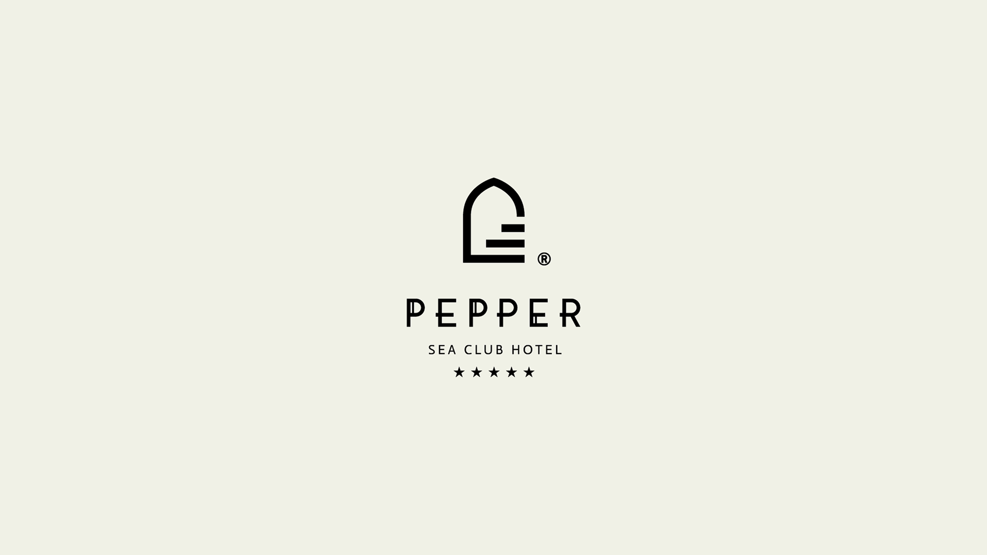
Pepper Hotel
A five-star and newly created resort in Crete, designed in a very moroccan architectural style, required a fresh visual identity.
The recognizable moroccan arch has been used along with elevating steps, common characteristics of Moroccan architecture.
A san serif typeface was designed to present the brand name of the hotel portraying a simple but elegant style as well.
IKONES Hotel
A brand new 5-star luxurious hotel in the city of Rethymno. A visual and brand identity was required to be designed for the promotion,
communication and presence of the hotel. A typographic logo was created for the name along with a symbol depicting a series of frames,
squares like photos & images laid out in a jewellery like shape.
Nefeli Hotel
According to Greek mythology, Nefeli was the Goddess of Hospitality. Hospitality was always expressed through giving. And still is.
Important as it was, the act of giving has been depicted in numerous ancient Greek illustrations. In almost all of them, there is a single
recurring element: the amphoreus, carried by those who give. Nefeli Hotel after a major renovation & rebranding required a visual
identity refresh. A new logo was designed along with numerous applications.
ALEGRIA Beach Resort
Alegria means joy, happiness and generally a comfort feeling. Alegria is a new four star resort in Crete.
Luxury was important to be presented somehow on the logo, so the typographic serif A was selected as a base
along with a bended line to symbolise a smile, thus creating a happy A for Alegria Beach Resort.
MARAVEL HOTEL
Maravel hotel has a long presence in the hotel market in Crete. After a significant star upgrade and a major renovation the hotel required
a new brand image to market accordingly. Two elements have been chosen to symbolise this new logo, the palm trees that surround the hotel buildings,
pools, restaurants and bars and the key as the symbol of hospitality & accommodation.
Alianthos Garden Hotel
A luxury hotel (almost four star) located in Crete. The inspiration for the logo came from the beach flower Alianthus,
which is a very common sighting around the area of the hotel.
White Swan Luxury Suites
A brand new City Suites & Apartments' business in Crete offering accommodation services to travelers visiting Rethymno city.
Luxury is a word defining your stay in White Swan, more like the beauty of the famous water bird. Logo depicts the initial W from the brand name
combined with a Swan's neck, wings and head in a very geometric style following the minimalistic but luxurious approach to all details of the business.
Menta Hotel
A new boutique hotel in the city of Rethymno. Focusing on the guests' hospitality and comfort. The name Menta is the flavour Mint in Greek
which can be translated into candies etc. The act of giving and offering is primarily an act of showing your hospitality in action.
Thus, the logo presents hearts on the left and right sides of a small candy offering to hotel guests and visitors. A circular shape in the middle,
like a hug is designed to symbolise the hotel’s hospitality and city centre location.
Ideon Hotel
Ideon is a hotel full of history in the old town of Rethymno. After operating for nearly half a century, it requested an identity refresh and
the original typographical logo was reshaped, refreshed and redesigned from scratch. The initials "I" and "H" were saved and redesigned
along with new typography on the name.
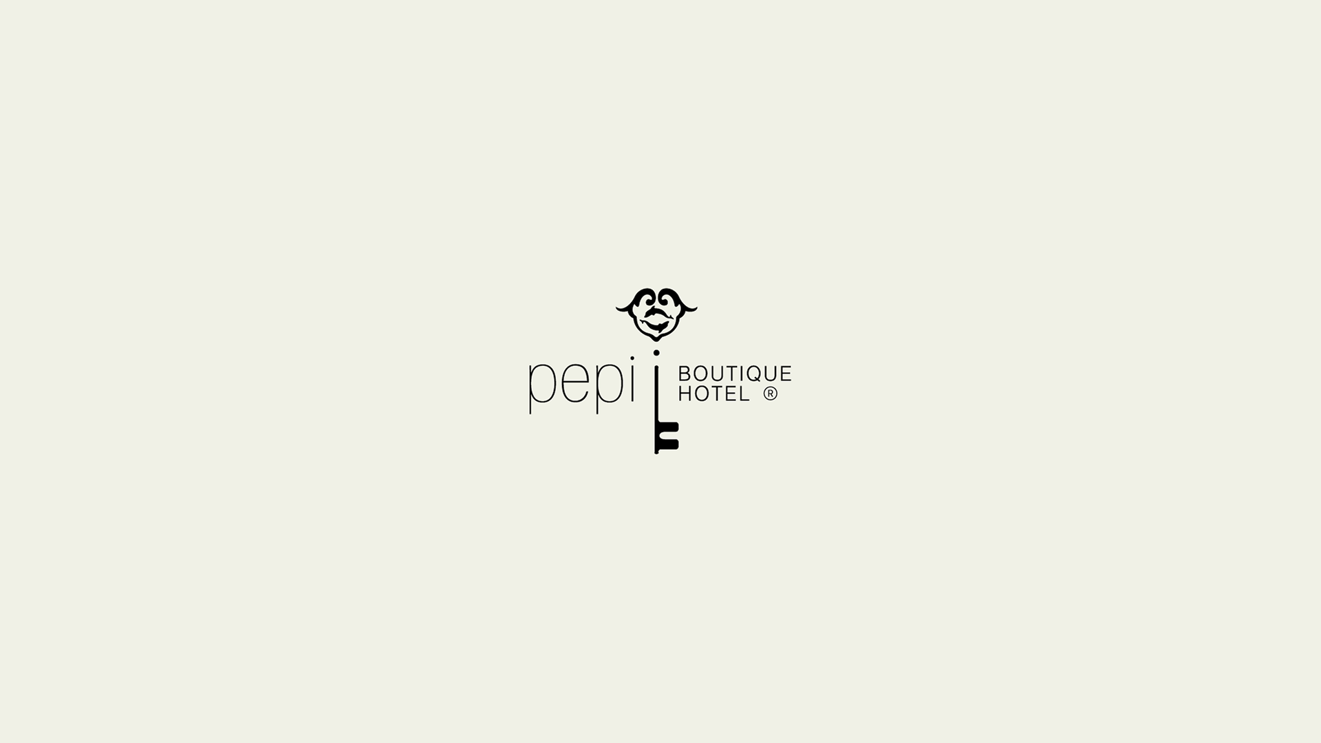
Pepi Boutique Hotel
In the old town of the majestic city of Rethymno, one of the best options for your accommodation would be Pepi Boutique Hotel.
After a major renovation, this apartments business upgraded to a Boutique Hotel. A traditional, old style key has been used to symbolise
hospitality and accommodation along with the dolphins, symbol of the town of Rethymno.
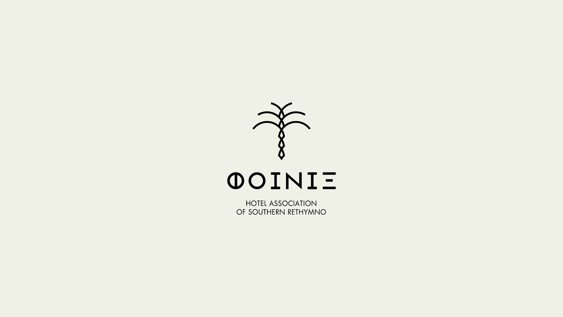
FOINIX HOTEL ASSOCIATION
Phoenix is a hotel owners' association. Uniting the hotels located on the Southern region of Rethymno, on the island of Crete.
Phoenix, in Greek, is not just the name of the mythical bird but also the word describing palm trees. The logo presents a palm tree.
The main tree body consists of small triangular shapes that bond to one another to create the palm tree and flourish at the top,
symbolising the strength and the success of such a union.
ARKADI
The souvenir store of Arkadi Monastery is releasing a line of products from local producers, such as honey, olives etc
and required a branded packaging and identity for their labels.
Souveniraki
A new brand creating unique souvenirs from Greece and especially from Crete was founded with the name Souveniraki which means "little souvenirs".
The Greek flag was transformed a bit on the cross section in order to show the gift wrap with ribbon to symbolise a gift from Greece.
Admiral Travel
A travel agency mainly focused on the transportation business. Offering airport pickup, drop-off, excursions and other travel services. The logo combines the patch of a Navy admiral with a location Pin and a star to symbolise the quality of services provided.
A few more noteworthy projects